Here To Slay, part 5: the new interface
Why the first thing after the course was redesigning every screen, where the idea of a tavern at night came from, and how rolls, cards and animations started following one system.
The screenshots in parts 2 to 4 show where the game stood at the end of the course. The logic worked, but the interface was a prototype: a gray lobby with loose buttons, a table where only the player whose turn it was understood what was going on, and cards with text too small to read. To play with friends, which had been the goal since part 1, that had to change before anything else.
The goal I wrote down was this: something more fluid that looked more like a game, keeping every feature that already existed. And with two constraints straight from the rulebook: you had to be able to read the cards, and everything the rulebook mentions had to fit on screen, from slain monsters to modifiers.
Design first, code second
Instead of jumping into the components, I started with a visual design: ten screens drawn on a canvas, clickable, before writing a single line of React. Title screen, table list, waiting room, initiative roll, leader pick, the game table, target picking, the challenge, the monster attack, the end of the match and a sheet with the whole visual system.
Designing first had an advantage I didn’t expect: it became easy to ask “what would the turn order roll look like?” or “where does the chat go?” while looking at a screen instead of a diff. Several ideas were dropped right there, before they cost any code.
A tavern at night
The visual direction came from the physical game itself. The table list became the tavern, and the waiting room became a table with seats around it, like when people sit down to play. The rest followed a few simple rules:
- A dark background, so the table and the cards stay in front.
- Parchment-toned cards, like the original art.
- Gold only on actions: if it glows, you can click it.
- Each class color was taken from the border of the cards themselves, and it always shows up next to the class icon, so it never depends on color alone.
- Two fonts: Grenze for titles and Nunito for everything else. They’re bundled with the app, because Electron’s security policy blocks fonts loaded from the internet.
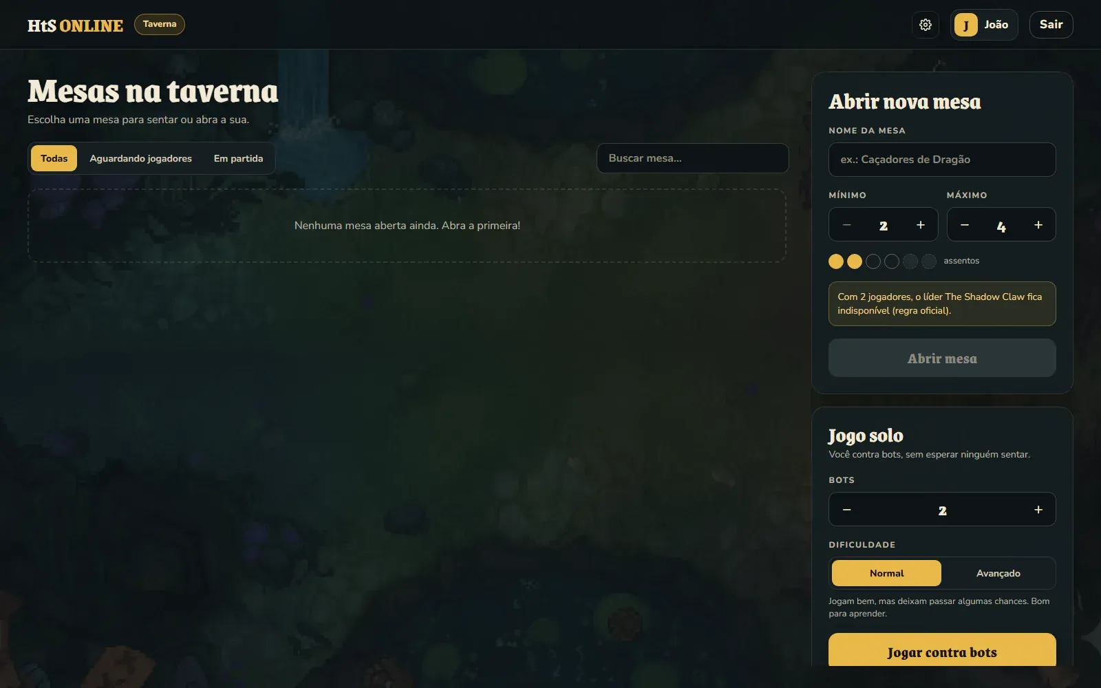
The screens below are from the current version, with two test players, João and Maria, just as I did in parts 2 to 4. The tavern shows the open tables on the left and, on the right, the forms to open a new table or play alone against bots:
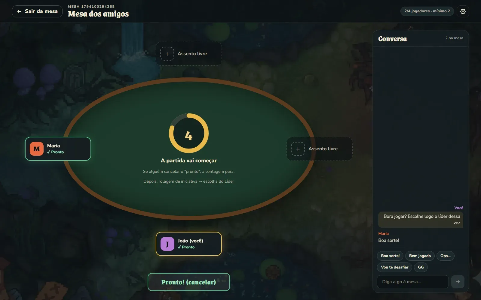
And the waiting room is the table seen from above, with each player in a seat:
Being able to read the cards
This was the hardest requirement. A Here To Slay table has a lot going on at once: your hand, your party, the monsters, the deck, the discard pile and every opponent’s party. If everything is reading size, it doesn’t fit.
The solution was to keep cards small on the table and large when you need them. Hovering over a card in your hand almost doubles its size and makes the text readable. Clicking any card opens an inspector with the card at full size, the keywords in its text explained and, for monsters, each roll range written out. And every opponent is visible at the same time, with their party, the classes they’ve collected and the monsters they’ve slain, because knowing who is close to winning is half the game.
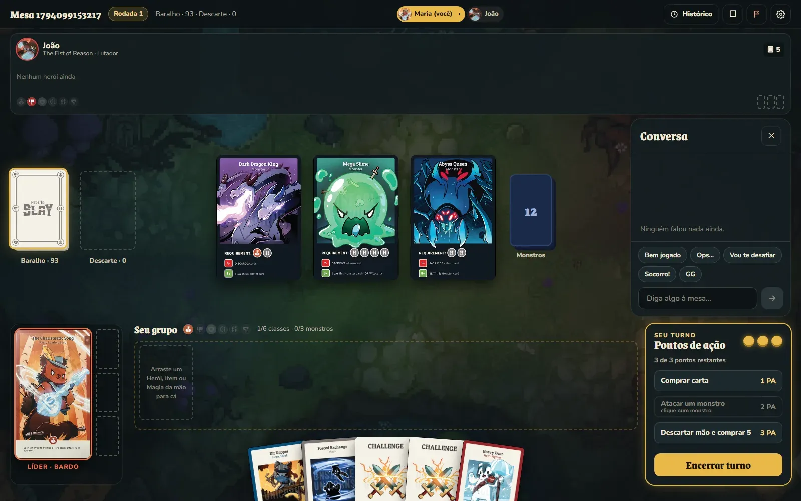
In practice, the table ended up like this. At the top, the opponent, with their party, classes and slots for slain monsters. In the middle, the deck, the discard pile and the three monsters with their requirements and roll ranges printed. At the bottom, your leader, your party and your hand. On the right, the action points and the chat:
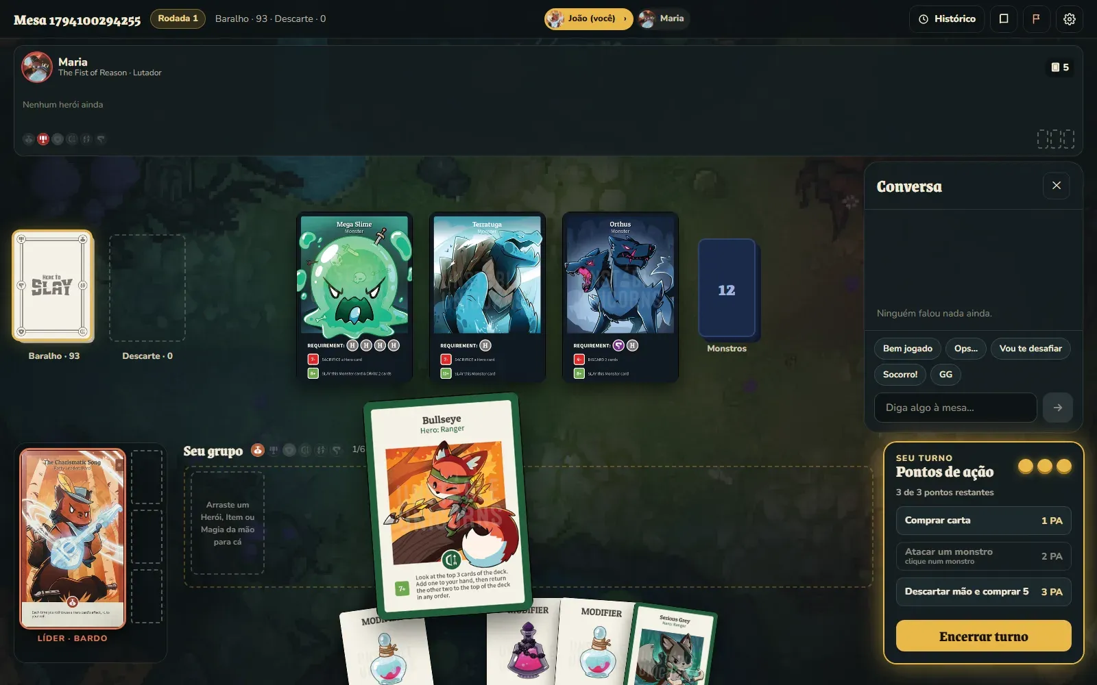
Hovering over a card in your hand lifts it and almost doubles its size:
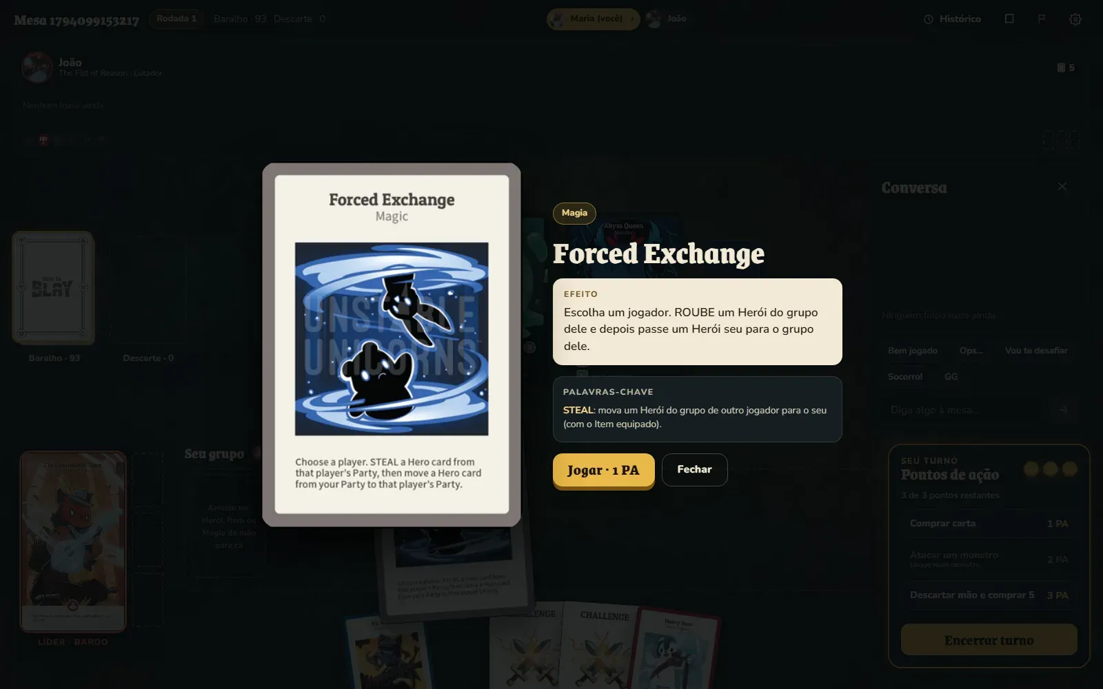
And clicking it, the inspector shows the translated effect, the keywords explained and the action you can take with it:
Every roll follows the same cycle
Here To Slay has four kinds of roll: initiative, a hero’s effect, a challenge and a monster attack. In the old version, each one showed up in its own way. In the redesign, they all follow the same cycle:
- Before: you see what you need to roll.
- Rolling: the dice spin for a moment.
- Result: the number lands on a 2-to-12 bar, with the success and failure ranges.
- Modifier window: anyone holding a modifier can change the total, and the bar follows.
- Resolution: success, failure or, for a monster, one of the three ranges.
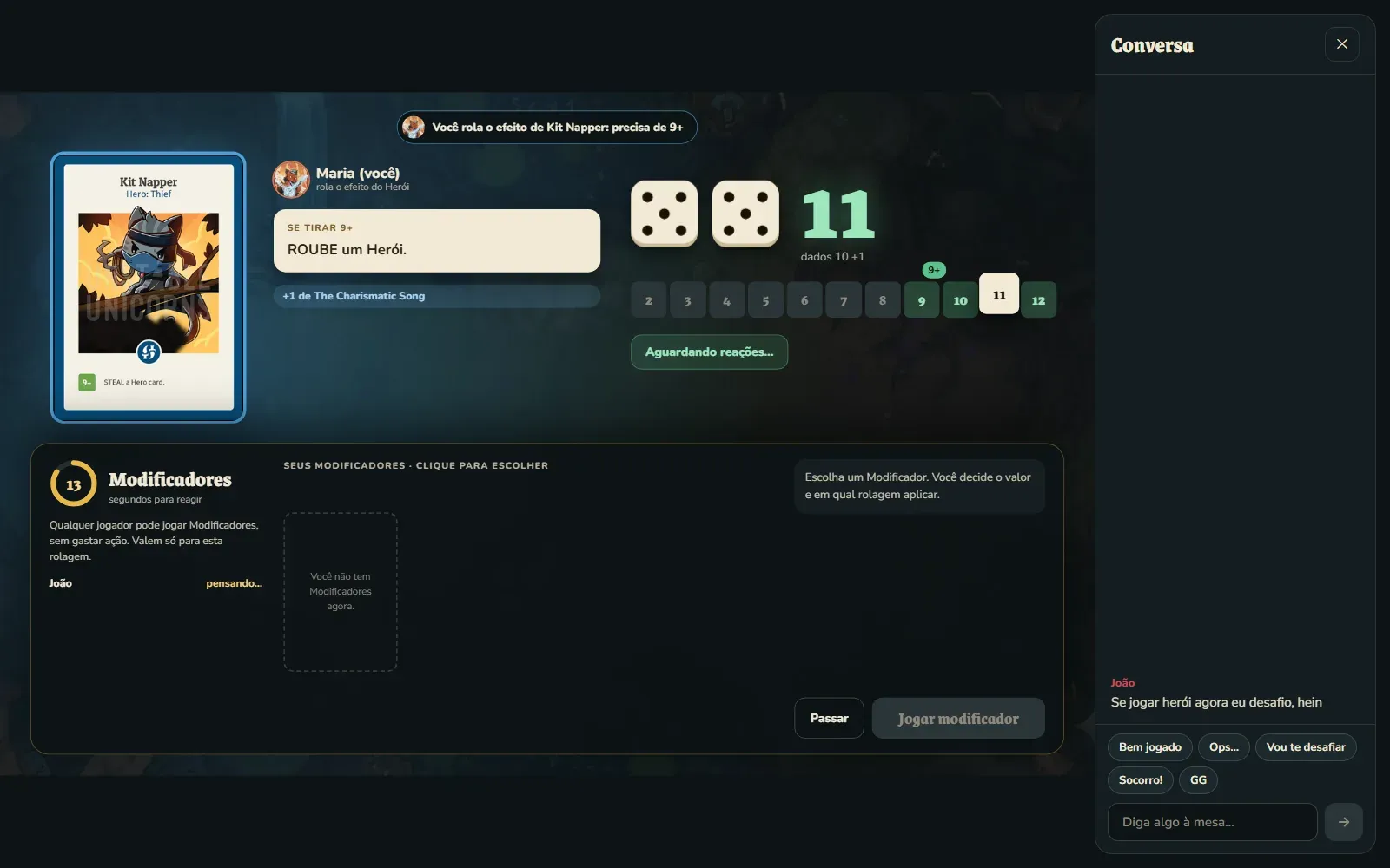
Here Maria rolled for Kit Napper’s effect, which needs 9 or more. The dice came up 10, her leader adds 1, and the 11 lands in the green range of the bar. Below, the modifier window is already open, with 13 seconds for anyone to react:
The only thing that changes between kinds is the scene around it. Challenges and monster attacks got scenes of their own, with the cards involved and each side’s dice, because those are the moments when the whole table stops to watch.
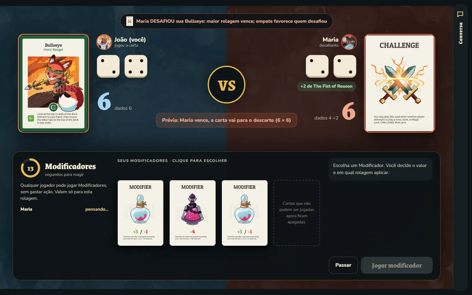
In a duel, each side of the screen belongs to one player, with the card at stake and each one’s dice. In this one, João played Bullseye and Maria challenged it. Both reached 6, because Maria’s leader adds 2 to every challenge, and the preview in the middle already says what happens if nobody plays a modifier: a tie favors the challenger, and the card goes to the discard pile.
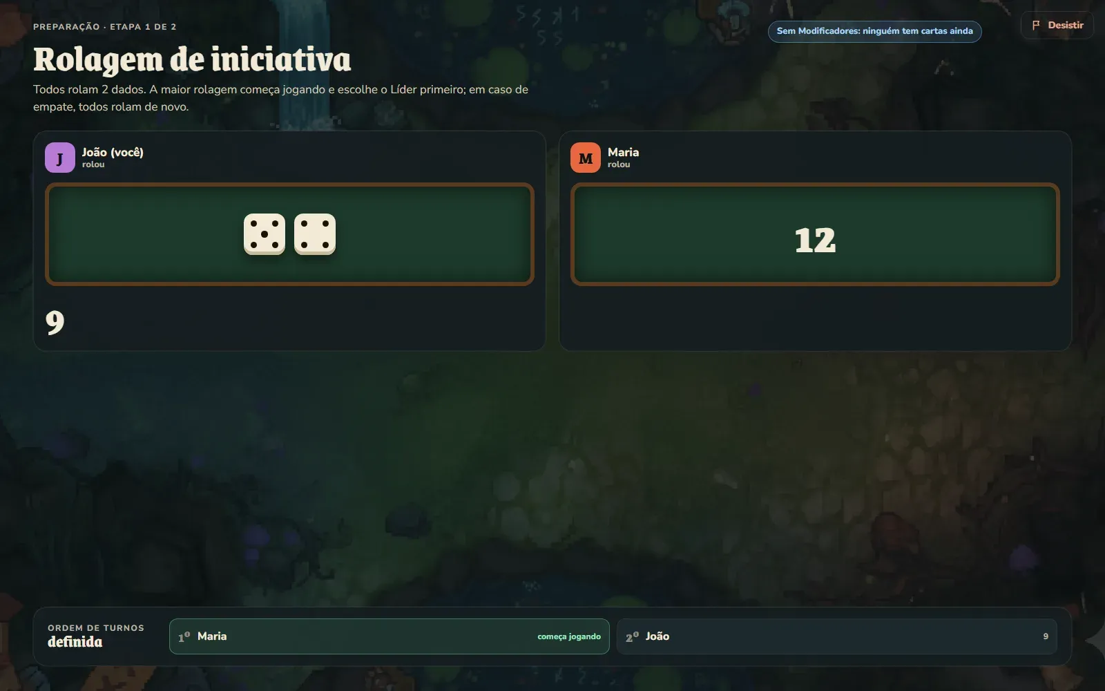
The match setup also got screens of its own. In the initiative roll, each player rolls both dice and the turn order builds up at the bottom:
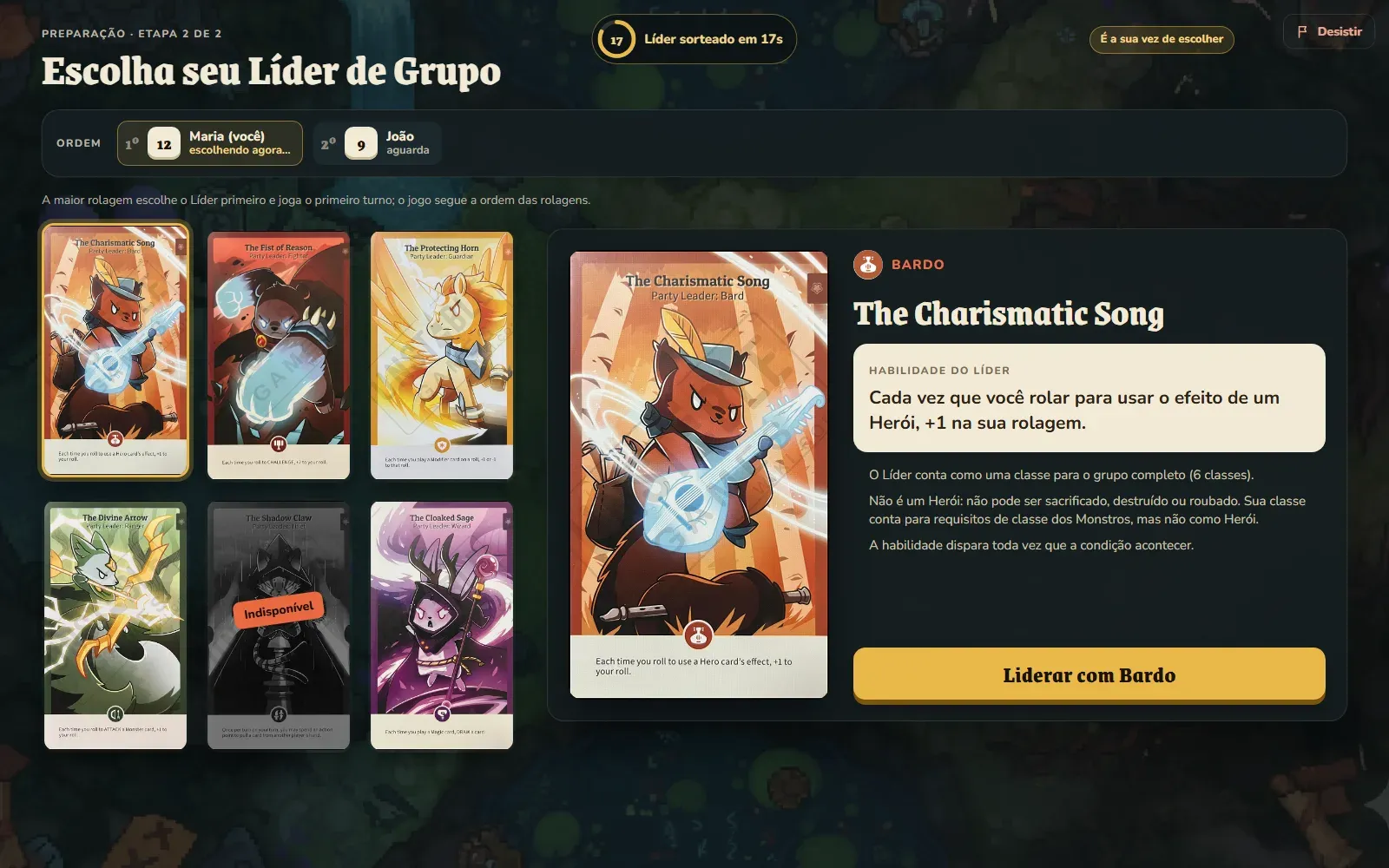
And in the leader pick, whoever’s turn it is sees each leader’s skill written out, with the time left before a random pick. With two players, The Shadow Claw shows up as unavailable, as the official rules say:
Animations that come from the state
In a physical game you see a card being stolen. Digitally, if nothing moves, a card just disappears from your party and shows up in someone else’s.
The server sends the full match state on every change, not “animation events”. So the client compares each state with the previous one to work out what happened, and animates from that: a drawn card flies from the deck to the hand, a destroyed hero catches fire, a stolen card arcs over to whoever stole it, and a modifier flies like a token to the roll. Since everything comes from the difference between two states, the server didn’t need to know anything about animation.
For anyone with “reduce motion” turned on in their system, the animations don’t show. And there’s a button to turn them on or off inside the game.
Three languages
Since the interface was being rewritten anyway, I added Portuguese, English and Spanish. The texts live in one dictionary per language, and Portuguese is the reference: if a key exists in Portuguese and is missing in English or Spanish, TypeScript doesn’t compile. That way no text is left untranslated by accident.
Some texts come ready-made from the server, like monster requirements and the Kafka Streams alerts from part 4. The client translates those from each one’s code. Only card names stay in English in all three languages, as they’re printed on the art.
Screen by screen
The switch happened gradually, from the outside in. First came the foundations (colors, fonts and shared components, like the card, the die and the timer ring), then the login and the tavern, the waiting room, the roll scenes, the match setup screens and, last, the table. The table was the last to change because it’s where all the other pieces meet, and only once it was done could the old match components be deleted.
In part 6, one of those pieces gets a post of its own: the chat. And in part 7, why this new interface ended up forcing a much bigger change underneath, in the game engine.